Designing an AI health app that older patients can trust
Orva explains diagnoses, medicines and care plans in simple words. It is for heart-failure patients at a public hospital in Western Australia. At first, the client only wanted a new look for a ready-made chatbot. In the end, I designed the whole product: the brand, the mascot, every patient screen, and the design system the developer used to build it.
Role
The only designer: brand, mascot, screens, design system and handoff
Client
Asmovian, a small med-tech company that works with a hospital
Timeline
Aug 2025 – Feb 2026, part-time freelance
Team
Me, the founder, a clinical lead and a React developer
Platform
8.7″ Android tablet (1340 × 800) in the hospital, and web
Users
Heart-failure patients. Many are over 65 and have never used a chat app
01The challenge
How do you make AI health advice easy to understand and easy to trust, for patients who may never have used a chat app?
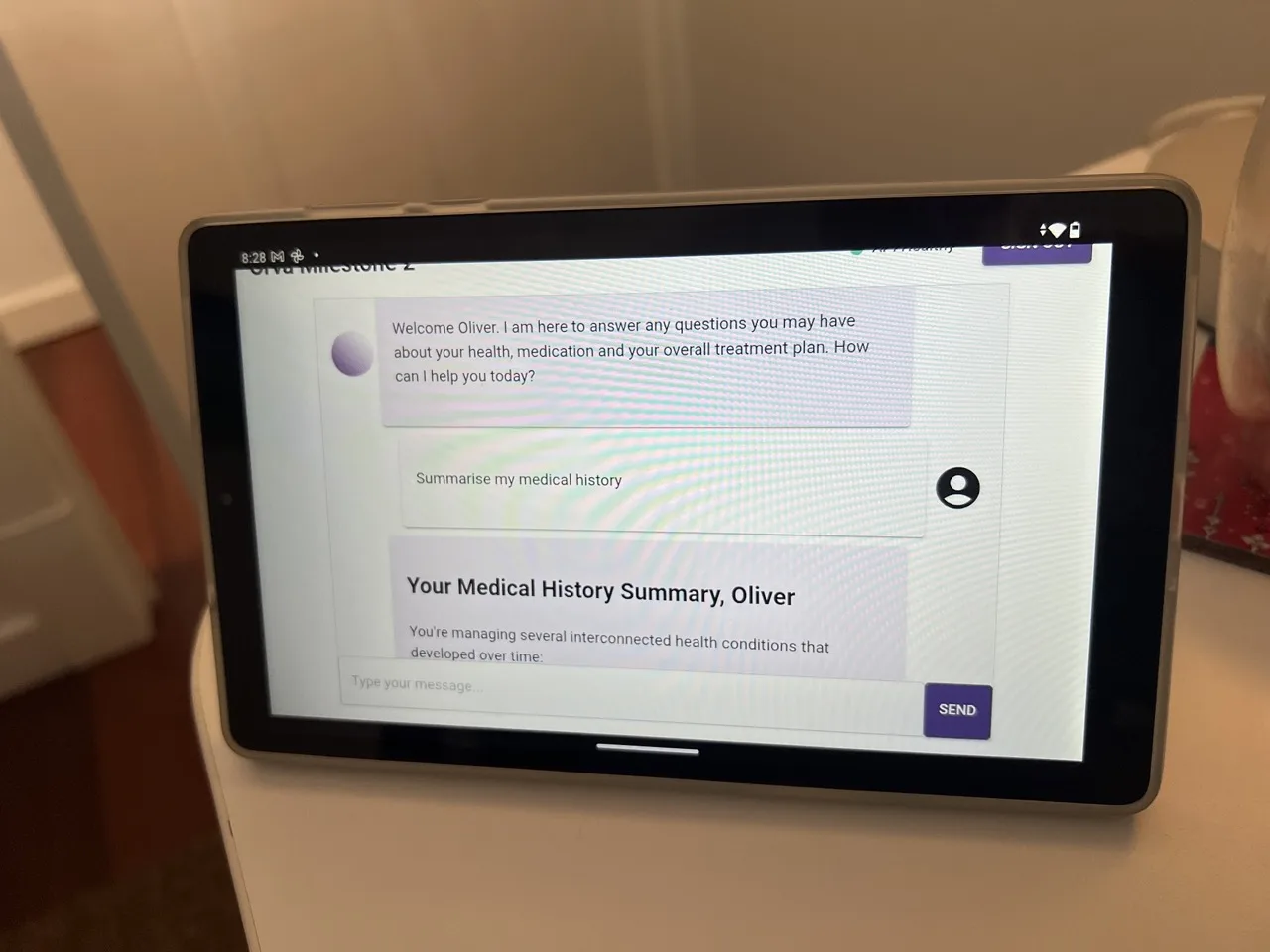
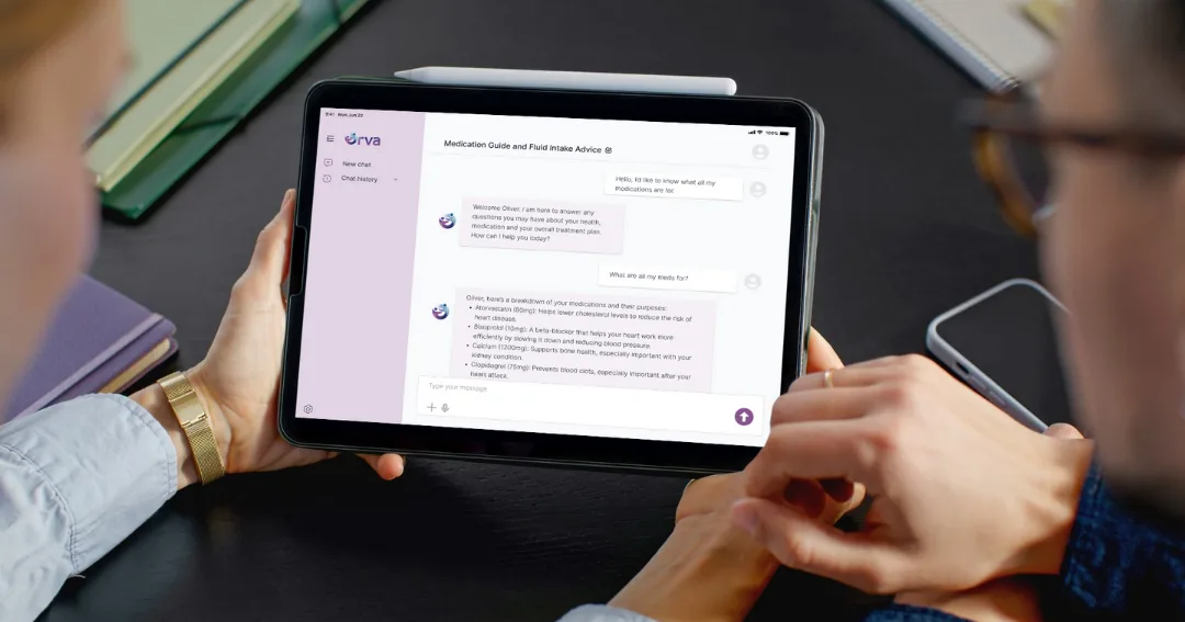
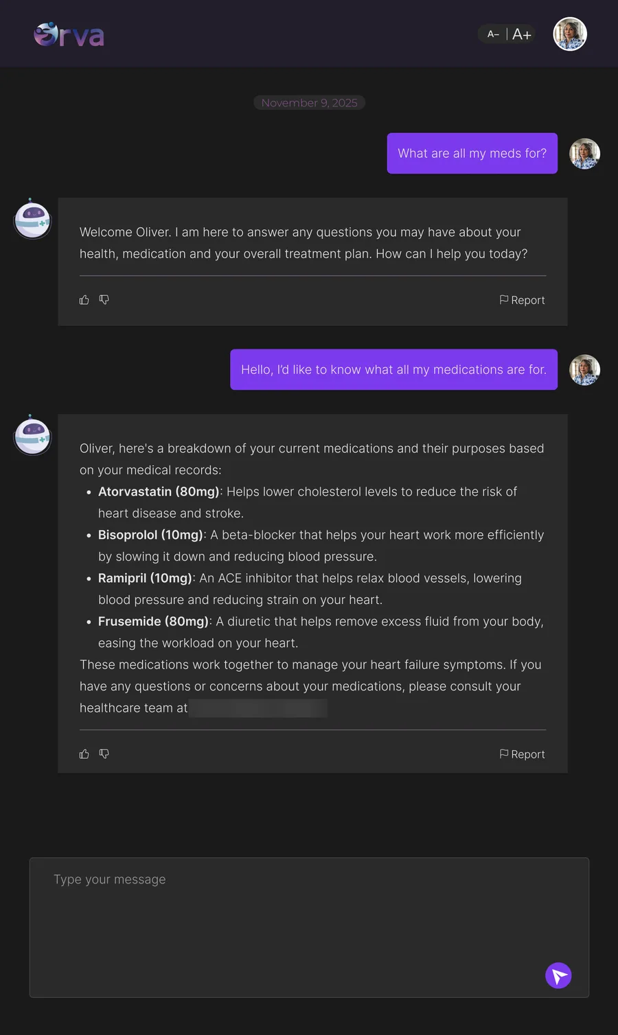
When I joined, Orva was a basic chatbot on the hospital tablet. The text was small, the AI replies were plain purple bubbles, and there was no brand. It worked. But for an older patient who had never used a chat app, nothing on the screen said this is safe, and it’s for you.
Before: the client’s ready-made chatbot on the hospital tablet.
Three rules for every screen
01ClearOne main action at a time. Big text, and nothing on the screen that the patient doesn’t need yet.
02FamiliarUse things patients already know, like a simple conversation and the tablet’s own buttons.
03Warm, not childishFriendly enough to calm people down, and serious enough to trust with medical information.
Making things bigger was not enough.The real work was giving patients fewer things to decide.
The limits I worked with
Older usersMany patients are over 65 and have never used a chat app.
One hospital tabletThere is only one device: an 8.7″ tablet, 1340 × 800. People use it in portrait and landscape.
Medical informationIt gives real medical information, so it has to feel correct and safe.
Room to growThe first version is for heart failure. Later it may cover diabetes, cancer and more, so the brand can’t be only about the heart.
Real deadlinesThe designs had to be ready for a consumer panel and a hospital demo. The developer was building at the same time.
02Key decisions
Clear · Familiar
Remove a control, don’t add one
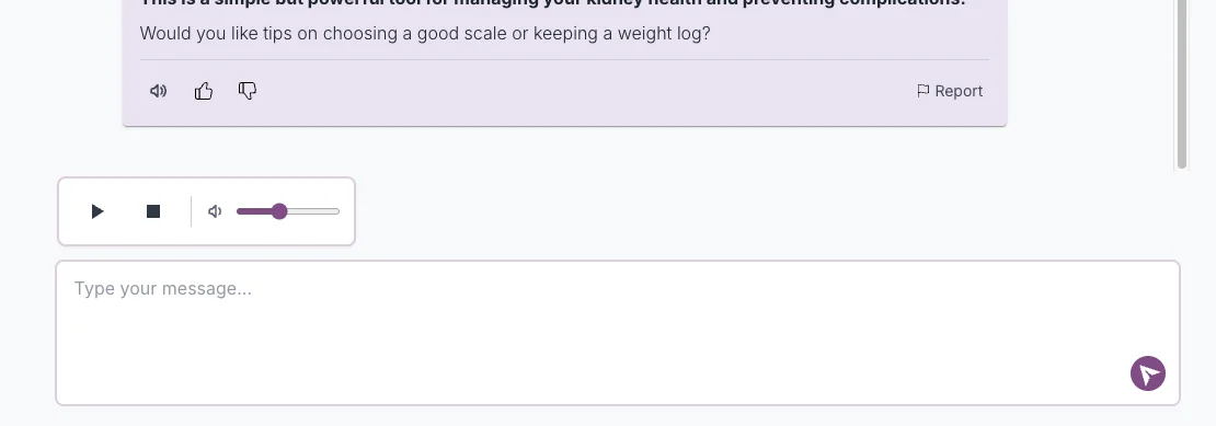
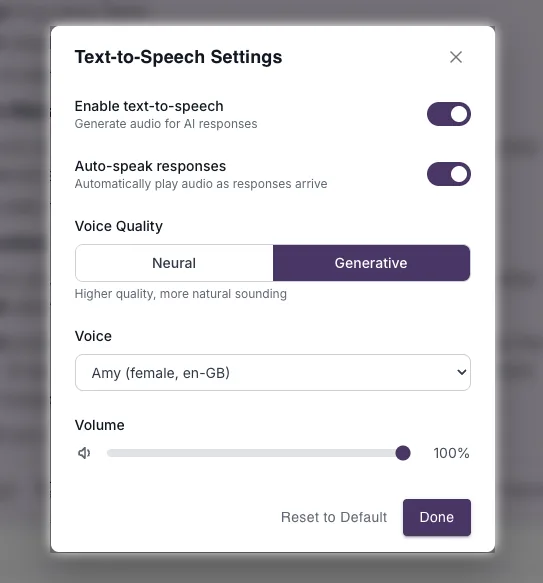
ProblemThe client’s first build had two volume controls: one in the audio player and one in settings. That meant two places for an older patient to make the same choice.
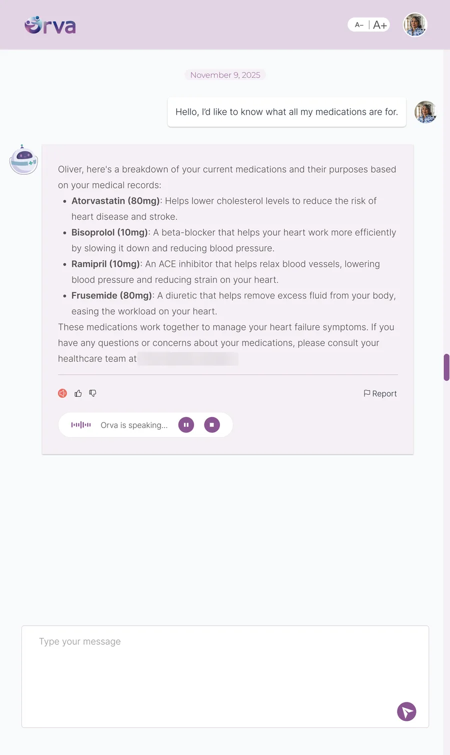
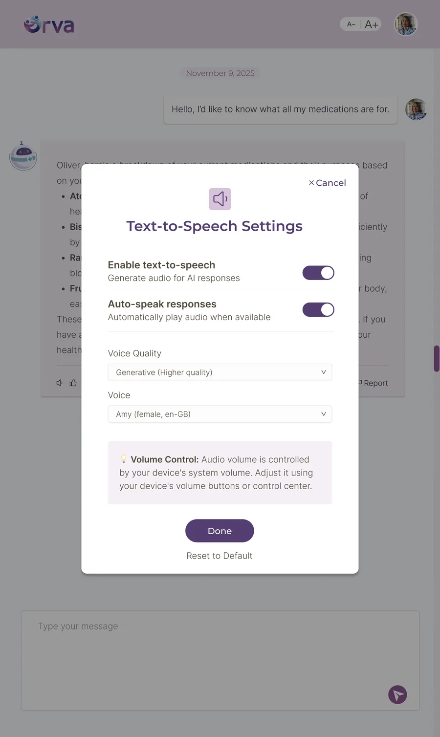
DecisionRemove both sliders and point to the tablet’s own volume buttons. Put a speaker button on each message, instead of one player for the whole chat.
WhyThe easiest control is often the one people already know. And people scroll back through the chat, so a speaker on each message always shows which one is playing.
Before
After
The player: one bar for the whole chat with its own volume. It was replaced by a speaker on the message being read, with pause, stop and “Orva is speaking…”.
Before
After
Settings: the second volume slider is gone. A note points to the tablet’s volume buttons.Clear
Designing for one tablet
My first chat design had a sidebar with chat history and settings. In a call, the client showed me the real device: an 8.7″ tablet, often used in portrait. The sidebar took up too much space.
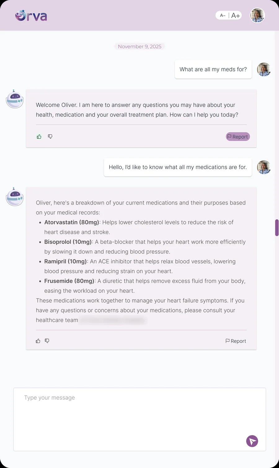
But the real problem was not screen size. It was attention. A sidebar asked first-time chat users to learn navigation they didn’t need yet. So I replaced it with a small top bar and one long conversation, and designed both portrait and landscape. I also took references and voice playback out of the first version to keep it simple, and added an emergency “Call 000” button.
Before
After
Dark mode
The sidebar took up too much space in portrait. The final chat has a top bar, one conversation and A−/A+ text size. Dark mode came later.Clear
Show the app instead of explaining it
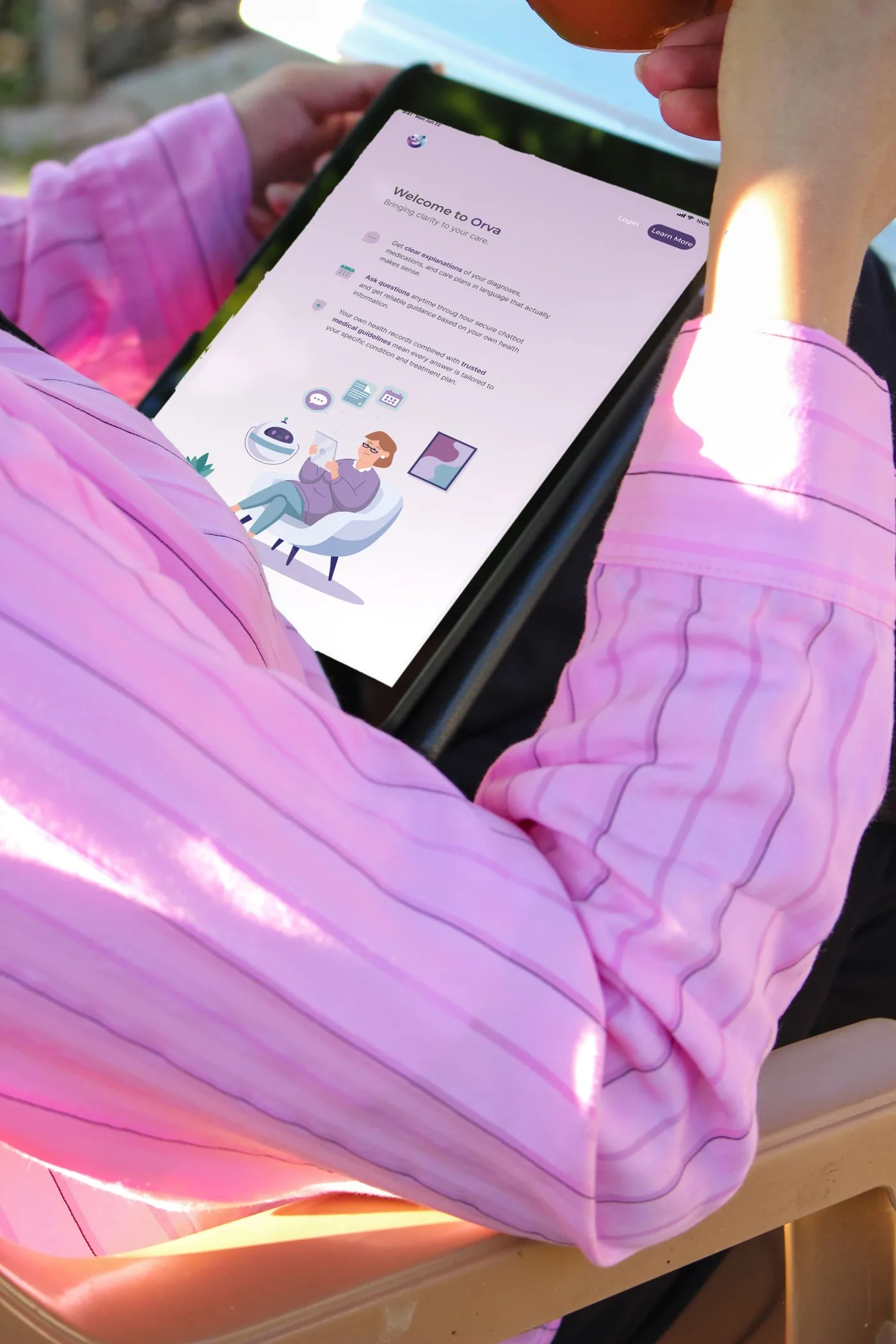
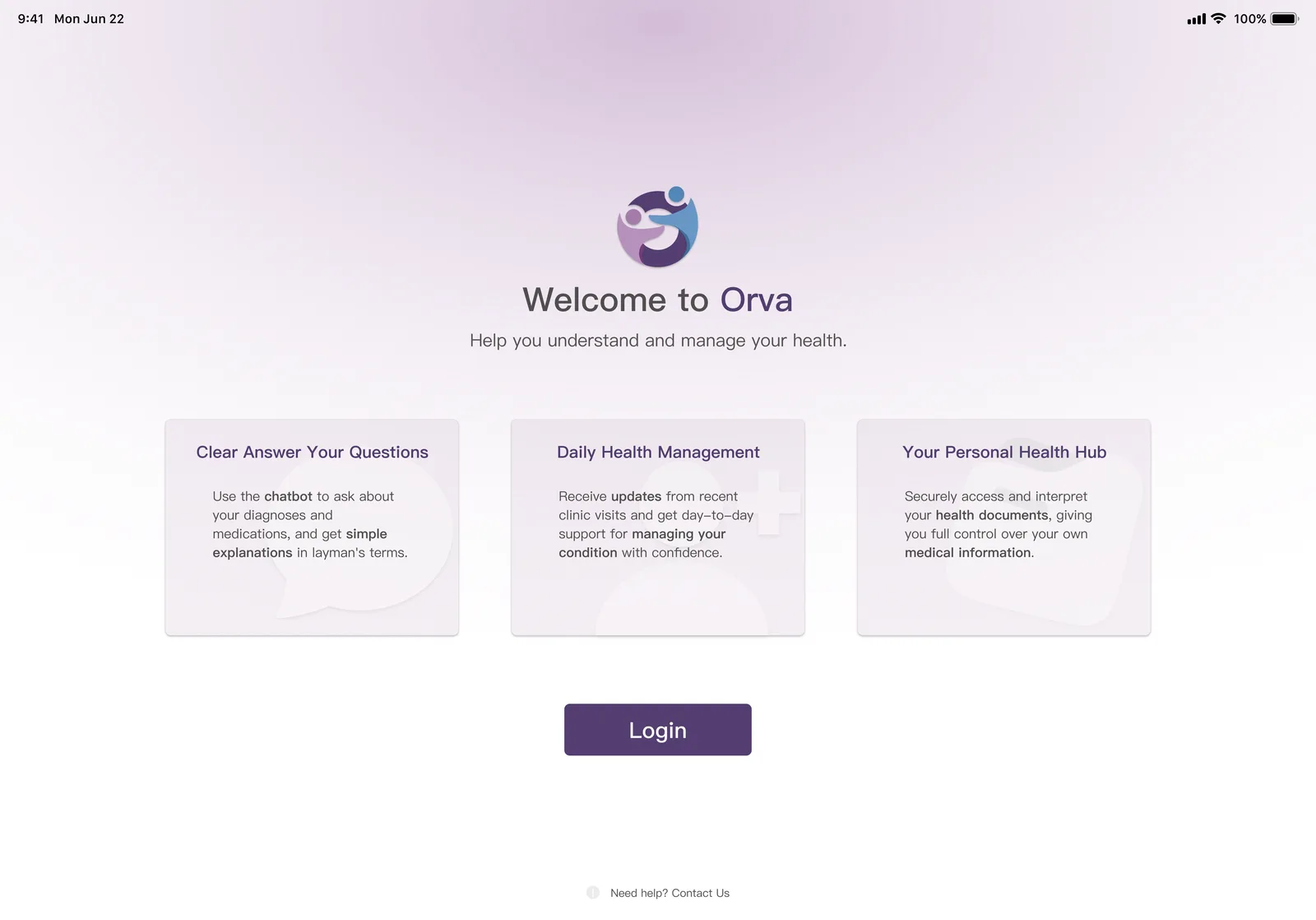
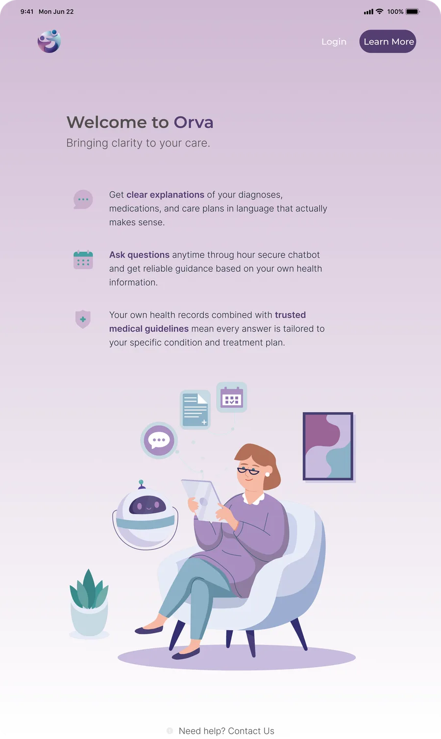
The first welcome page explained Orva in three text cards. But people who have never heard of Orva won’t read three cards. Before I redesigned it, I asked one question: one big image, or a step-by-step tutorial? They chose one image. So the page became one illustration of a patient using Orva, with Login in the corner.
After the client saw it, I made the character look younger. People in their late 50s and older still want to feel young.
Before
After
v1 explained Orva with three text cards. The final page shows it with one illustration, and Login is in the corner.Warm, not childish
A logo about people, not medicine
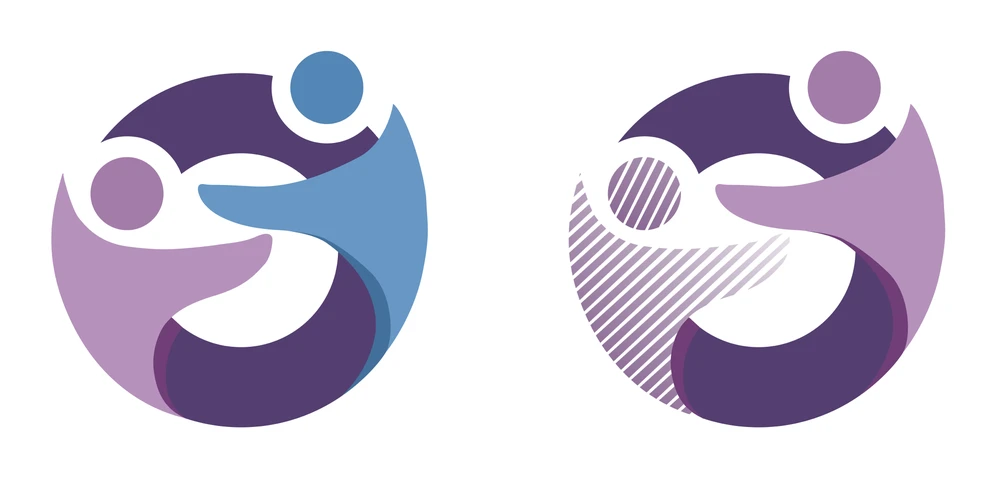
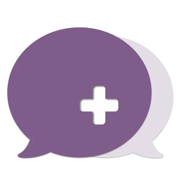
A medical cross says “hospital”. But Orva will grow beyond one illness, and it should feel like care, not like a clinic. I tried three ideas, and the clinical lead chose two people hugging inside an “O”. It means care, it works as the “O” in Orva, and it isn’t about one illness.
1 · A medical cross
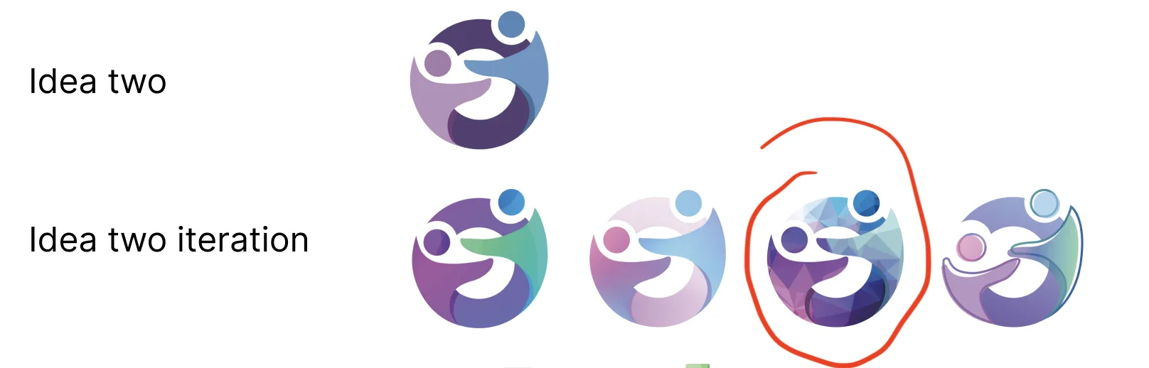
2 · Two people hugging ✓
3 · A chat bubble with a cross
Three ideas: trust, connection and conversation. The clinical lead chose connection.
Iterations
Final
Two more rounds on the chosen idea, then the final logo. The icon becomes the “O”.Warm, not childish
A mascot that makes AI feel safe
Patients need to know who is talking to them. The small robot started as decoration, and became “the face of Orva”: it is next to every AI reply. I added a medical cross so it looks like a care helper, not a toy, but it is still friendly.
Before
After: a cross on the band
03How the project worked
There was no formal research stage. The client team tested my designs with patients and hospital staff, and I changed the designs based on their feedback. Over seven months, this happened through more than 100 emails, Figma comments and video calls.
1Send a roundI sent a Figma link and a short email: what I changed, and how it answers each comment.
2Client reviewThe founder and the clinical lead reviewed it. Sometimes they also showed it to a consumer panel or hospital staff.
3Ask firstBefore each round I asked questions. For example: should the welcome page have one big image, or a step-by-step tutorial? They chose one image, and that decided the layout.
4Change and recordI kept every round in Figma on a dated timeline, so anyone can see what changed and why.
Feedback was getting lost, so I split the Figma file into three pages: Drafts with dates, Tasks & Decisions, and a clean Handoff page. I asked the client to comment only on the Handoff page.
04Four turning points
01The brand became about peoplemedical → humanThe clinical lead chose two people hugging over a medical cross.
02The real tablet changed the navigationsidebar → top barA sidebar was too wide on an 8.7″ tablet in portrait.
03Older users changed the formsmany choices → one actionNotify Me became one optional line, with no extra consent tick.
04The real build changed text-to-speechone player → a speaker on each messageAnd the extra volume sliders were removed.
See the full timeline (9 rounds)
Feb 2026
Text-to-speech
A speaker button on each message, instead of one player for the whole chat. Volume slider removed
My suggestion after the client’s first build
Jan 2026
Feedback states
Selected colours for thumbs up / down and “Report”, added to the design system
Client: the colours in the build looked wrong
Dec 2025
Chat + Notify Me
Dark mode, scroll bars, privacy policy checkbox and page
Comments from the client and the clinical lead
Nov 2025
Chat screen
Sidebar replaced by a top bar and a small menu. One long conversation. Portrait and landscape
Call with the client: the sidebar was too wide on a portrait tablet
Nov 2025
Mascot
Medical cross added to the robot. It became “the face of Orva”
Client: make it look more medical
Nov 2025
Notify Me
Role choice on one line and optional. Consent tick removed. Cancel button added. Smaller dialog
Client review of v1
Oct 2025
Notify Me
Sign Up replaced by a “Notify Me” dialog for interested patients and clinicians
The product moved to a waitlist before launch
Oct 2025
Welcome + logo
One big illustration instead of text blocks. Login moved to the corner. Younger character. Final logo
Consumer panel deadline and client feedback
Sep 2025
Welcome + logo
First round: three logo ideas. Welcome page with three text cards and Login in the middle
First brief
05Outcome
7 weeksFrom the first designs to a working demo for hospital staff, built from my files.
100+Emails, Figma comments and calls with the client team.
They kept coming backPatient app → clinician portal → a new project from the founder.
The designs went straight into the real product. After the first demo, every round was built from the Figma handoff and design system. A year after the first round, the founder contacted me again: Orva is “progressing well” and moving to a clinical trial.
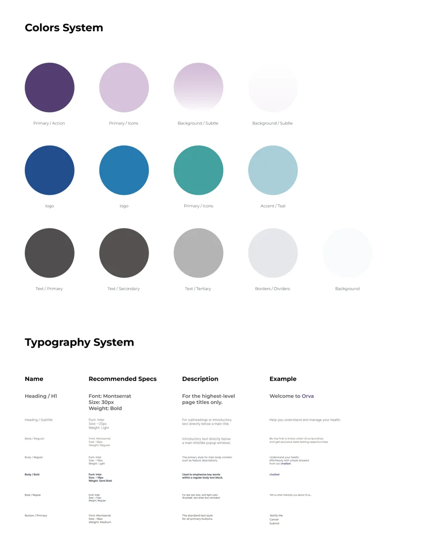
Part of the design system the developer used.
Delivered
Logo, mascot, welcome / login / Notify Me flows, patient chat in portrait and landscape, dark mode, text-to-speech controls, and a design system with feedback states.
Built as designed
The developer built the screens straight from my Figma handoff and design system. When the coded colours looked wrong, I added the missing states to the design system.
What I’d do differently
Make a clean handoff file from the first day. I only reorganised it in the middle of the project, after comments started getting lost.